Creating custom stacked icons with FontAwesome
FontAwesome is an excellent resource for web developers, providing almost 1500 icons for free. Whilst these are often enough for your use case, sometimes additional icons are needed. For example, on my portfolio I wanted a square icon for each social media service, but only 6 out of 10 services had a square icon available!
In this tutorial, I’ll show how to create square icons for any FontAwesome icon, as well as circular, borderless, and a few other variations. A Gist of the approach is available, if you’d just like to see the code.
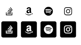
As mentioned before, here’s the end goal: 10 matching icons.
If we’re just using existing FontAwesome icons, we’d end up with the following. Note the 4 mismatching icons!

Throughout this tutorial, the current progress of the 4 mismatched icons will be shown alongside their final forms, so that every change is immediately obvious.
Displaying initial icons
First, our starting code is an <a> tag (to link to the service), containing an <i> tag (to display the FontAwesome icon):
<a href="https://stackoverflow.com/u/608312" target="_blank">
    <i class="fab fa-stack-overflow"></i>
</a>
This displays a basic icon, in the default link colour for the page (black). The example above is for StackOverflow, when applied to all 4 icons it ends up like this:

It’s a start, they’re all clearly much too small and mismatching though!
Preparing for stack
To prepare for the “stack” used to layer icons with a fixed background, all the icons need to be made larger, and be consistent. To do that, a few FontAwesome classes need to be applied to the parent element, in this case our <a>.
Our code from before now becomes:
<a class="fa-stack fa-2x fa-fw" href="https://stackoverflow.com/u/608312" target="_blank">
    <i class="fab fa-stack-overflow"></i>
</a>
fa-stackprepares the icon for stacking. The most noticeable effect of this is an increase in spacing around each icon.fa-2xdoubles the size of the icon, since they’re far too small currently.fa-fwsets the icons to be a fixed width, necessary for them to fit in a grid of icons.
We’re already pretty close! Just need to add the stacked background, and our icons will be ready to go.
Implementing stack
To implement the stack, a “2x size” and “1x size” icon needs to be defined. In our case, our service icon needs to become 1x, this is done by adding the fa-stack-1x class to it.
Additionally, it needs inverting (since the background colour is going to be the current text colour), so fa-inverse is also added to the classes.
Finally, a brand new element needs adding; the background. In this example we’re using fa-square behind the icon, so the background is placed before the icon in the code hierarchy. This background also has fa-stack-2x, since it’s going to be larger. The final result is:
<a class="fa-stack fa-2x fa-fw" href="https://stackoverflow.com/u/608312" target="_blank">
    <i class="fas fa-square fa-stack-2x"></i>
    <i class="fab fa-stack-overflow fa-stack-1x fa-inverse"></i>
</a>

All done! A Gist of my portfolio’s implementation is available if you’d like to see the final version.
Alternative implementations
All squares
Using the stack technique for all icons does improve consistency, both in the UI and in the code. For example, replacing fa-linkedin with fa-linkedin-in or fa-github-square with fa-github, then performing all the other steps. However, some services (only IMDb in my case) doesn’t have a non-square icon! Here’s the 10 services, with all the existing square icons converted to stacked square icons:

All circles
Replacing all fa-square backgrounds with fa-circle results in the following. Note the IMDb inability to play nicely!

Tower
To create a “tower” of icons, with no gaps, just replace fa-square with fa-square-full and a <br> between each icon:

Other shapes
Most FontAwesome shapes work well as a background. Here’s fa- play / certificate / comment / heart / cloud, most of which look pretty good!

Further modifications
Since these icons are using FontAwesome, the usual modifiers can be used, simply by applying additional classes:
- Rotating / flipping:
fa-rotate-90/180/270,fa-flip-horizontal/vertical. - Spinning:
fa-spin.
Summary
As mentioned before, a Gist containing this tutorial’s code is available. Making all brand icons on your site fit a common design helps them feel like a more natural part of your site, instead of just stuck on top. A live implementation is available at the top of my portfolio.
It’s also worth mentioning FontAwesome’s Pro offering. This provides nearly 3x as many icons, such as outlined and light versions of the square / circle backgrounds. For $60/yr it’s unlikely to be worth it for a single site, but if web developing at all professionally, it’s likely worth it!