Creating a custom Android ActionBar
By default, new Android projects have an ActionBar at the top (also known as a title bar), which usually contains a title, an optional back button on the left, and optional action(s) on the right. For many cases, minor customisations to colour are enough, but if a project requires exactly meeting a client’s design more advanced functionality will need to be utilised.
This tutorial will walk through the steps needed to turn a default ActionBar into a fully customised area of the screen, whilst keeping useful functionality like displaying a back button intact. Kotlin is used for this sample project, but all code can be easily converted to Java.
Retrieving the ActionBar
Retrieving the ActionBar is a simple case of myBar = actionBar!! in an Activity, or myBar = supportActionBar!! in an AppCompatActivity. The assignment is forced (!!) since we know the action bar will exist.
Removing default effects
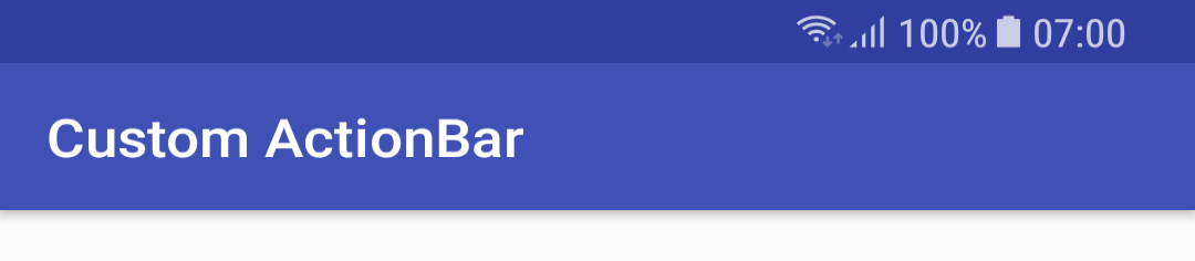
First, the elevation needs to be removed using myBar.elevation = 0f. By default, the elevation causes shadow to be cast on the rest of your screen, and also forces a potentially unwanted dividing line between the ActionBar. Once this is removed, the action bar can blend seamlessly into the content of the app (once we set up a custom view later on).

Creating a custom layout
Now our custom layout needs to be created. The design of this of course depends on your requirements, but the overall structure should be a RelativeLayout at res/layout/element_toolbar.xml with the following layout parameters:
<RelativeLayout xmlns:android="http://schemas.android.com/apk/res/android"
android:layout_width="match_parent"
android:layout_height="wrap_content"
android:layout_gravity="fill_horizontal">
This layout functions just like any other layout file, and can be filled with ImageViews, TextViews, etc.
Setting a custom layout
Next, our custom layout needs to be enabled and configured:
myBar.setDisplayShowCustomEnabled(true)
myBar.setCustomView(R.layout.element_toolbar)
Additionally, since we’re going to be handling title text in our element_toolbar.xml, we should turn off displaying text:
myBar.setDisplayShowTitleEnabled(false)
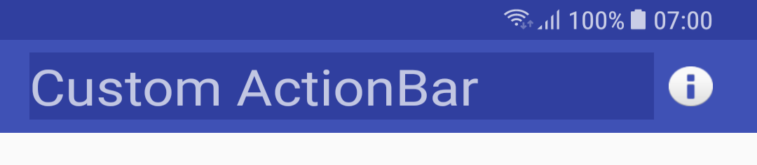
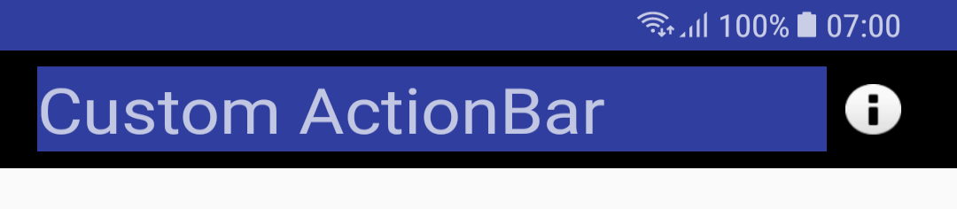
We now have a custom toolbar! However, there’s a pretty glaring issue, in that our custom layout doesn’t actually reach the edges of the ActionBar, so the default design can still be seen. To fix that we need to…
Override ActionBar background
First, inside AppTheme in /res/values/styles.xml add the following line:
<item name="actionBarStyle">@style/CustomBar</item>
And add the following style inside the same file, but outside of AppTheme:
<style name="CustomBar" parent="Widget.AppCompat.ActionBar.Solid">
    <item name="background">@android:color/black</item>
</style>
Next steps
An example project is provided for this tutorial, with an example of how to set click events for items inside your custom ActionBar. It can be downloaded / forked from GitHub.
If you have any questions about the topic covered, please comment or join the Android Dev discord.