5 niche but powerful HTML elements that can prevent you reinventing wheels with JS & CSS (e.g. expanding content)
A recent update to this site added a collapsible table of contents. After looking at a few JS / CSS solutions, I discovered there’s a details built-in HTML element that does everything I wanted! Here’s how to use it, and a few other useful HTML elements I’d never heard of.
I’ll include a live preview for each element (which will inherit the site’s styling), as well as screenshots & a link to a default version.
<details> & <summary> expanding content
These 2 are why I’m writing this post! The details element creates a hidden section of text that can be toggled by clicking the summary. This is very commonly required functionality, and even the default usage looks acceptable:
The arrow to the side behaves as you’d expect, and since it’s a unique HTML element it can easily be styled. Here is how it looks with my site’s styling (almost identical), followed by the source HTML:
Details
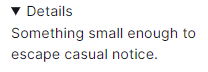
Something small enough to escape casual notice.<details>
<summary>Details</summary>
Something small enough to escape casual notice.
</details>
Tips:
- The
detailstag can haveopenadded to it, making the content appear expanded initially. - When toggled, content around the
detailselement will rearrange. - Mozilla developer docs.
<datalist> suggested input values
Everyone knows about select and option for dropdown lists… but what if you only want to recommend specific answers, not insist on them? Introducing datalist.
Datalist is essentially a way to provide input with a list of recommended or suggested values, whilst still letting the user enter anything they want.
This could be useful for a search field displaying the user’s last few searches, common search terms, or a thousand other uses. It works by defining the datalist separately from the input element itself, connecting them with a list parameter.
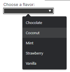
Here’s how it looks with my site’s styling, and the source HTML:
<label for="ice-cream-choice">Choose a flavor:</label>
<input list="ice-cream-flavors" id="ice-cream-choice" name="ice-cream-choice" />

<datalist id="ice-cream-flavors">
  <option value="Chocolate"></option>
  <option value="Coconut"></option>
  <option value="Mint"></option>
  <option value="Strawberry"></option>
  <option value="Vanilla"></option>
</datalist>
Tips:
- The
datalist/listattribute also works on non-text inputs, e.g. numbers, times, ranges, and even colours! - It can be tricky-to-impossible to style the “popover” options, so it’s not ideal for sites with strong branding.
- The accessibility isn’t ideal, with some screen readers not interpreting it correctly.
- Mozilla developer docs.
<del> & <ins> change tracking
Tracking changes to a document is typically done via commit history, change logs, or similar techniques. Usually the changes are highlighted via some custom colouring (e.g. green for inserts, red for deletions). This is fine, but sites could / should be using the del and ins elements and styling them!
These elements make a lot of logical sense, just surrounding the deleted or inserted text with the tag. By default, browsers display this as strikethrough and underline, however background colours or highlighting would likely be a more modern approach.
Here’s an example simply applying an additional background-color to both elements in CSS and removing the ins underline:
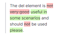
The del element is not very good useful in some scenarios and should not be used please.
The del element is <del>not very good</del> <ins>useful in some scenarios</ins> and should <del>not</del> be used <ins>please</ins>.
Tips:
del&inscan have aciteattribute, containing a link to an explanation, changelog, etc.del&inscan have adatetimewith a date string and optional time of the change.- Unfortunately as these niche elements are rarely used, screenreaders typically don’t handle them well.
- Mozilla developer docs
<wbr> word break suggestions
Okay, this is the first element that I understand why it isn’t more widely used. I only read and write English, which tends to have relatively short words. As such, I don’t think about word breaks, they rarely if ever happen.
However, this isn’t the case for languages like German (or scientific papers), where word structure differs and can result in surprisingly long common words:
In German, there are no noun clusters, the way you can string nouns together in English as modifying words to describe the final noun. The German solution for this is just to string them all together into a word.
As such, the ability to suggest opportunities for a word break location could be helpful. The example below uses a narrow space to show 3 line break solutions:
- No recommendations. Notice how the letters fill each line, potentially resulting in awkward breaks.
wbrused multiple times, with some being used to break at a logical place.­used multiple times, behaving similarly towbrbut with-symbols.
2:ABCDEF
3:ABCDEFGHIJKLMNOPQRSTUVWXYZABCDEFGHIJKLMNOPQRSTUVWXYZ
1:ABCDEFGHIJKLMNOPQRSTUVWXYZABCDEFGHIJKLMNOPQRSTUVWXYZ
2:ABCDEF<wbr />GHIJKLMN<wbr />OPQRSTUVWXYZ<wbr />ABCDEFGHIJKLMN<wbr />OPQRSTUVWXYZ
3:ABCDEF­GHIJKLMN­OPQRSTUVWXYZ­ABCDEF­GHIJKLMN­OPQRSTUVWXYZ
Tips:
- Although
­looks better, it has the downside of including the-in the text itself, preventing easy copying of the text. As such,wbris probably better for anything that won’t be printed out. - Mozilla developer docs.
<ruby> annotations above text
Despite the cryptic name, ruby refers to a unit of typographic measure, which somehow relates back to showing pronunciation of (typically) East Asian characters or words.
However, it can also be used for other purposes, such as showcasing an encryption cypher:
JRQLX
It’s a somewhat confusing element to use, with 2 sub elements:
rt: The pronunciation tip to show above the previous word.rp: The parenthesis used as a fall-back for browsers that do not supportruby. These are used for an opening and closing bracket around thert, and are quite unusual.
I’m going to use English numbers and words to simplify the examples. Notice how much more complicated the rp element makes the source code!
- The total is: 101
- The total is: 101
- The total is: 101
- The total is: 101
* The total is: <ruby>101<rt>One hundred and one</rt></ruby>
* The total is: <ruby>1<rt>One</rt>0<rt>Zero</rt>1<rt>One</rt></ruby>
* The total is: <ruby>101<rp>(</rp><rt>One hundred and one</rt><rp>)</rp></ruby>
* The total is: <ruby>1<rp>(</rp><rt>One</rt><rp>)</rp>0<rp>(</rp><rt>Zero</rt><rp>)</rp>1<rp>(</rp><rt>One</rt><rp>)</rp></ruby>
Tips:
- There seems to be no way to space out the top text if it is wider than the bottom text.
- Notice that the
rpelements essentially exist just to optionally show a fallback bracket. - If the
rpcannot be omitted, the easiest way to add them once your text is written. The same string is used before and after everyrttag. - The unusual text layout can make it hard to select / copy, so use sparingly.
- Mozilla developer docs.
Conclusion
Overall, I was amazed how many elements I had no idea even existed, let alone used them. Like most people, I learnt the basics ~15 years ago and pretty much stuck to them.
Whilst I’m vaguely aware that W3C maintains HTML, and it is constantly evolving via RFCs… I don’t keep up with them whatsoever. Occasionally a new feature will burst into the mainstream, but there are countless others that didn’t quite make it, were only introduced temporarily, or just don’t make sense on the modern web. I’m glad these are all documented on Mozilla’s developer docs, which seems fairly authoritative.
There’s plenty more elements that I didn’t cover over on the Mozilla docs, for example what on earth are aside, search, kbd, or portal elements!?
I also didn’t look into the oddities hidden within “Obselete and deprecated elements”, since they should no longer be used. How about a tt, xmp, or even a dir?
If I end up having a bit too much spare time and/or go slightly mad, I might make this site strictly follow the recommended usage of HTML elements, technically making an extremely accessible site. I doubt it’ll actually make a difference to anyone using screenreaders or search engines (since most sites don’t do it), but it might be a fun project!
PS: RIP <marquee> 🫡
Header is from codewithfaraz.com, a great resource that really needs a more detailed table of contents.