This blog has migrated to Jekyll!
You are now reading these words from a Jekyll-powered site, not Wordpress! But what does that actually mean?
Well, I’ll be covering Why I Switched, How I Switched, and a few more detailed topics soon, but essentially the site is now:
- Much faster
- Much cleaner
- Much easier to work with
- Free to run!
Speed
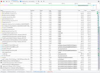
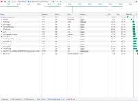
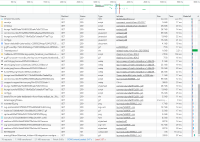
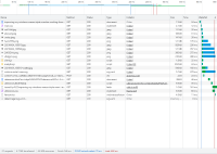
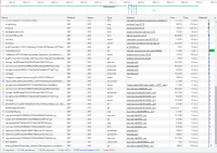
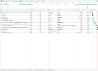
I compared some “before” and “after” scenarios, to see how much faster the speedy new site is:
All requests are from the live site, via Cloudflare, skipping local cache. Repeated 3x, middle value taken.
Since the newer site is essentially all prerendered pages displayed when requested, it’s drastically faster. It’s also much, much simpler. However, you might have noticed in the above screenshots that the new site actually often transfers more data. For a streamlined, simple site, this would seem bizarre, until you look at the requests being made.
The new site only has 1 copy of every image. If I’ve been silly and used a giant screenshot as the post header, that’s the only size available! Previously, Wordpress would have a few copies of every image, and show the appropriate size. Once I’ve implemented this to the new site, speeds should improve slightly, and page size too.
2022-02-16 update: Thumbnails are now implemented, we’re no longer loading the full image!
Appearance
| Page | Wordpress | Jekyll | Comment |
|---|---|---|---|
| Homepage |  |
 |
The Wordpress site had far too much going on. Whilst I do like the compact post previews, I prefer the visually striking banners on Jekyll. Since my blog is all about content, stripping everything else away seemed the best approach! |
| Post |  |
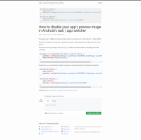 |
The post page has improved more than the homepage. Code samples are now far more readable (they’re the point of the blog…), and the content of articles is the focus. For less code-based articles (example), the differences are even more noticeable. That being said, there’s still some tidying to do. |
Writing & Maintaining
Previously when writing a post I had to stay online, and use the Wordpress WYSIWYG editor. This was OK for simple formatting like bold text, but I would often need to preview the actual post. This preview took up to 10 seconds to load.
Now, I can write posts anywhere, using the syntax I’m most comfortable with, and can pick from a variety of offline clients with live preview etc (currently VSCode). I’m still figuring out the “drafts” process (hence this post!), but since it all runs on Git it should be fine!
Additionally, since the posts and site files are all essentially plain text, I can search & update them all very easily. This is so, so much nicer than trying to navigate a clunky web interface, especially when making changes to the site’s structure / code. For comparison, just loading my Wordpress dashboard took 6-7 seconds. A full rebuild of the Jekyll site takes ~5 seconds, with subsequent builds taking 1-2 seconds.
Cost
Previously I was paying $8.99/mo to host this site via BlueHost.
I am now paying $0, thanks to GitHub Pages. A tiny bit cheaper.
Conclusion
Whilst the blog is now migrated, there’s a TON of cool things I now have the ability to do! Keep an eye out for future Jekyll-related posts…
