How to add padding to an Android vector drawable
When adding icons to Android apps, you’ll generally be working with square icons. For example, the excellent built-in vector icon library (also available online) only contains perfectly square icons.
Sometimes however, these vector icons are used in a non-square place. With a normal image file adding extra padding is easy, not so with a vector file!
This tutorial will cover how to modify a square vector image to add any padding you want, without any changes to your app’s layouts. The icon used is a white access_time, used to represent a loading state.
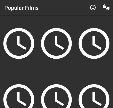
In my app, a StaggeredGridLayoutManager is used to display 3 movie posters per row. These movie posters are always the same size, and a ratio of 1:1.5 width:height.
Using the icon
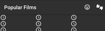
If the ImageViews are initially set to our loading icon (either as a default image or a Picasso placeholder), the size difference is immediately obvious:
<vector android:height="24dp"
    android:viewportHeight="24.0" android:viewportWidth="24.0"
    android:width="24dp" xmlns:android="http://schemas.android.com/apk/res/android">
    <path android:fillColor="#FFFFFF" android:pathData="M11.99,2C6.47,2 2,6.48 2,12s4.47,10 9.99,10C17.52,22 22,17.52 22,12S17.52,2 11.99,2zM12,20c-4.42,0 -8,-3.58 -8,-8s3.58,-8 8,-8 8,3.58 8,8 -3.58,8 -8,8zM12.5,7H11v6l5.25,3.15 0.75,-1.23 -4.5,-2.67z"/>
</vector>
Resizing our vector drawable
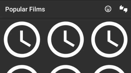
Our vector image is too small! This is due to the android:height="24dp" android:width="24dp" initially included in the icon, enforcing a maximum size. Setting these both to 240dp fixes the horizontal spacing issue, but the 1:1 ratio conflicts with the movie poster’s 1:1.5. This results in the movie posters constantly pushing each other and the loading icons around as they load, making for a very unappealing UI.
<vector android:height="240dp"
    android:viewportHeight="24.0" android:viewportWidth="24.0"
    android:width="240dp" xmlns:android="http://schemas.android.com/apk/res/android">
    <path android:fillColor="#FFFFFF" android:pathData="M11.99,2C6.47,2 2,6.48 2,12s4.47,10 9.99,10C17.52,22 22,17.52 22,12S17.52,2 11.99,2zM12,20c-4.42,0 -8,-3.58 -8,-8s3.58,-8 8,-8 8,3.58 8,8 -3.58,8 -8,8zM12.5,7H11v6l5.25,3.15 0.75,-1.23 -4.5,-2.67z"/>
</vector>
Adjusting the ratio of our vector drawable
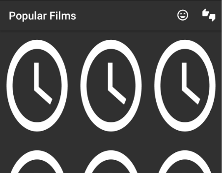
So, the drawable needs to be resized so it is the same ratio as the eventual real content. For example, a width of 200 would require a height of 300. Making these changes stops the movie posters / loading icons pushing each other around, but the icon has become stretched!
<vector android:height="300dp"
    android:viewportHeight="24.0" android:viewportWidth="24.0"
    android:width="200dp" xmlns:android="http://schemas.android.com/apk/res/android">
    <path android:fillColor="#FFFFFF" android:pathData="M11.99,2C6.47,2 2,6.48 2,12s4.47,10 9.99,10C17.52,22 22,17.52 22,12S17.52,2 11.99,2zM12,20c-4.42,0 -8,-3.58 -8,-8s3.58,-8 8,-8 8,3.58 8,8 -3.58,8 -8,8zM12.5,7H11v6l5.25,3.15 0.75,-1.23 -4.5,-2.67z"/>
</vector>
Adding padding inside our resource
The solution is to add padding to our vector drawable, to keep the original 1:1 ratio. This is done by adding a <group> around the <path>. This group will scale the content inside it (the actual icon), without affecting the overall size / ratio of the vector.
Since the scaleX and scaleY parameters are relative, they must be set to 1 or less to avoid cropping. For example, setting scaleX to 0.99 and scaleY to 0.66 will obey the 1:1.5 ratio required. Note that pivotX and pivotY set the centre point of the scaling, and should be half of your viewpointWidth and viewpointHeight (e.g. 12).
<vector android:height="300dp"
    android:viewportHeight="24.0" android:viewportWidth="24.0"
    android:width="200dp" xmlns:android="http://schemas.android.com/apk/res/android">
    <group
        android:scaleX="0.99"
        android:scaleY="0.66"
        android:pivotX="12"
        android:pivotY="12">
        <path android:fillColor="#FFFFFF" android:pathData="M11.99,2C6.47,2 2,6.48 2,12s4.47,10 9.99,10C17.52,22 22,17.52 22,12S17.52,2 11.99,2zM12,20c-4.42,0 -8,-3.58 -8,-8s3.58,-8 8,-8 8,3.58 8,8 -3.58,8 -8,8zM12.5,7H11v6l5.25,3.15 0.75,-1.23 -4.5,-2.67z"/>
    </group>
</vector>
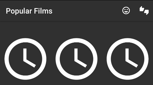
Finally, it looks reasonable! Note that if we wanted more padding on the sides, a scaleX of 0.8 and scaleY of 0.4 would increase the padding on all sides.
Hopefully this tutorial has showed how group can be to scale the content of an SVG down. This technique can even be applied to individual parts of an SVG if there are multiple paths!