Blog updated (v2.1) with table of contents and anchor links!
Whilst Jekyll’s Minima theme is great, there’s a couple of very basic features I wish it had by default. I added the features myself today, and decided to start doing “release notes” style posts for the codebase used in both my blogs!
Table of contents
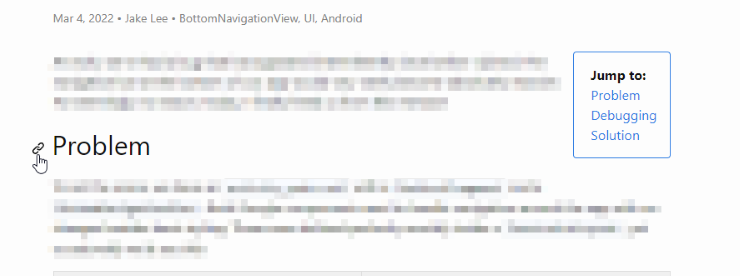
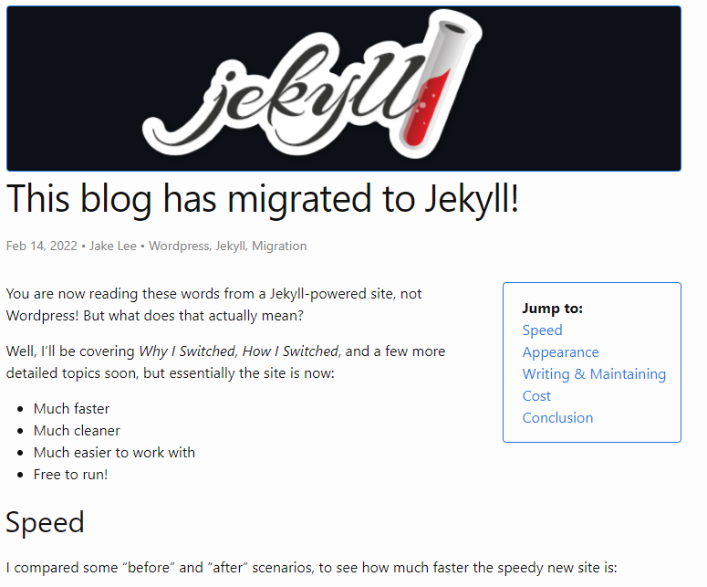
Some of my longer posts (example) can be quite hard to orientate yourself in, despite the various headings. Adding a table of contents should alleviate this, but I wanted to avoid any JavaScript-dependent solutions or any that weren’t flexible.
Introducing “Jekyll Pure Liquid Table of Contents”, a very easy to implement solution that meets my requirements! Once I’d downloaded the .html file and added the following to my post.html, it was done:
  <div class="toc">
    <b>Jump to:</b>
    {% include custom/contents.html html=content %}
  </div>
Out of the box, this introduces a very simple unordered list of all headings in the post. This is alright to start with, but I wanted to add a little bit of styling.
I decided to make the contents “float” in the top right of the post, hide the list styling, and add a simple border similar to the homepage cards. These changes can be seen in the table of contents CSS.
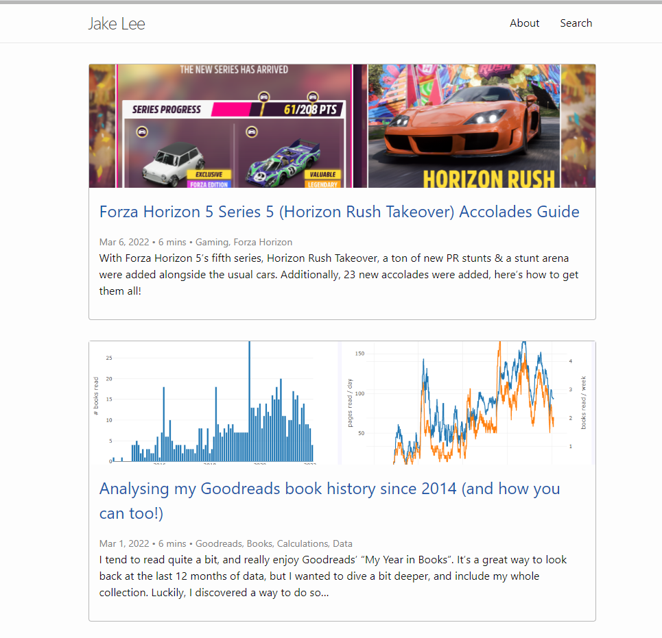
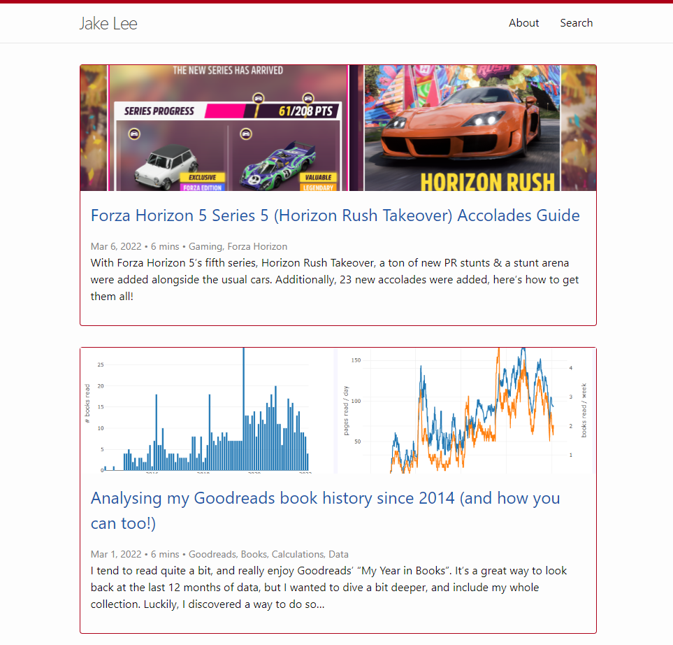
| Site | Before | After |
|---|---|---|
| Software |  |
 |
| Non-software |  |
 |
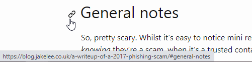
Anchor links
Somewhat related to the table of contents, sometimes I want to link someone to a specific part of a post. Whilst this is technically possibly by manually editing the URL (since Jekyll automatically gives all headers an ID), it’s not very user friendly.
Luckily, the same dev who created the table of contents script also created one to add heading anchors! It’s just as easy to install.
Out of the box it offers a usable but basic experience, adding a clickable character after each heading to get the link. I used the code from one of the provided examples to make this button appears to the left of the headers, and be invisible until the header is hovered over. This makes the link functionality a bit less prominent, whilst still available to those who want it.
Styling changes
I also decided the non-programming blog needs more of an accent colour. Whilst grey was fine to start with, it’s not very distinctive! For now, only a few elements have had this colour applied, but eventually links should use it too.
| Before | After |
|---|---|
 |
 |
Coming in v2.2
- More comprehensive “accent” styling for non-programming blog.
- Fix the pagination becoming left-aligned again!
- Check all headers etc are accessible for visually impaired users.